
Martinrea
Elucidating System State in a File Directory
Some images are best viewed on a wider screen.
Overview
Martinrea is an automotive manufacturing company specializing in automating the production of stamped and welded parts. During my internship as a UX Designer for the Innovation Team, I was responsible for the experiences and interfaces behind our computer vision and AI technologies.
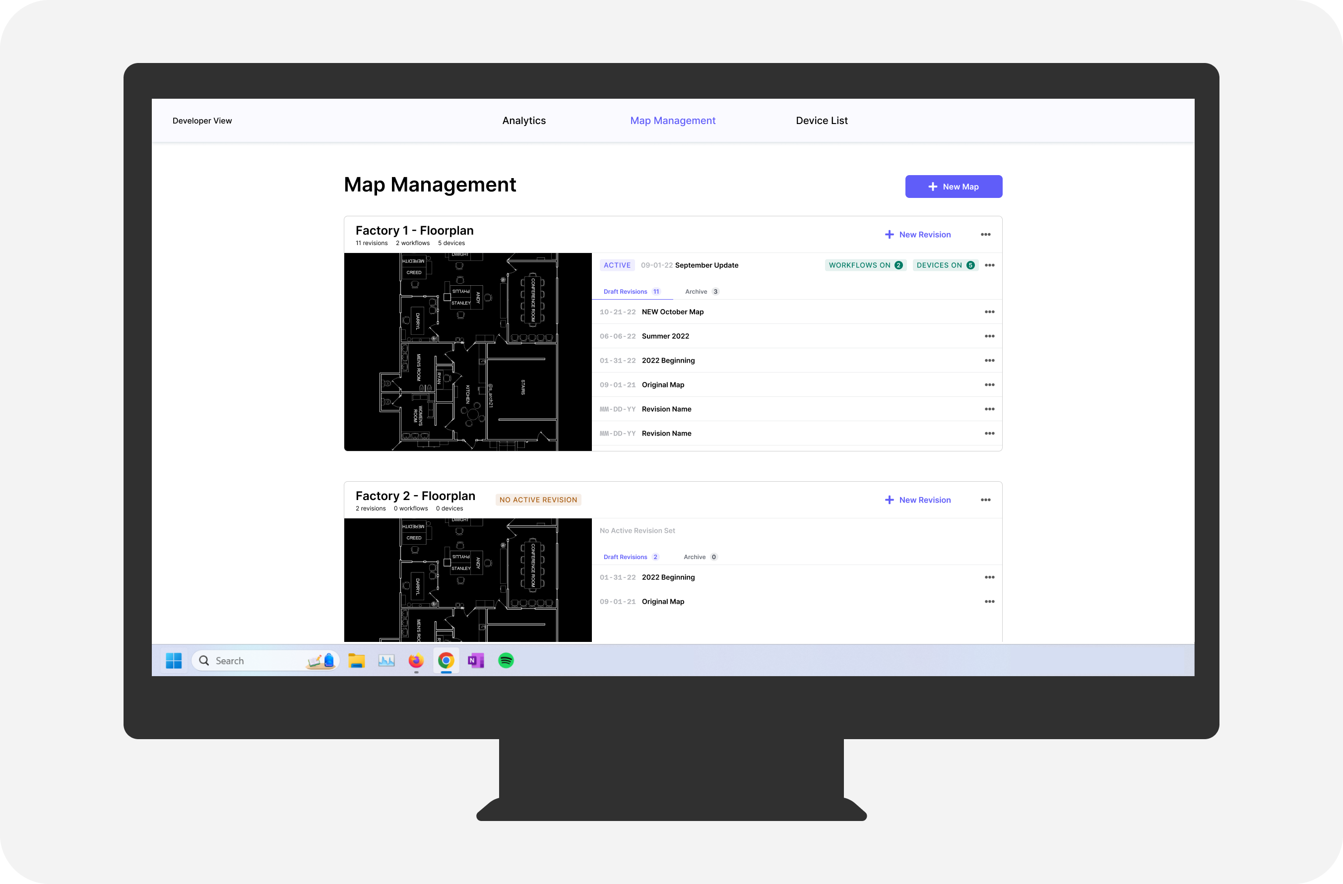
FE is an internal web platform used to implement and manage these technologies. Specifically, the page for managing location-linked action sequences (a.k.a. workflow revisions or just 'revisions') for active devices on the manufacturing plant floor needed updating. This page is referred to as the 'Map Management' page with the term 'map' referring to the uploaded floorplan of the manufacturing plant.
Timeline
1 month (started Sept 2022)
Project Team
1 UX Designer (me)
1 Product Owner
Discipline
Web Design
Problem
Engineers need to view and edit the correct revisions for the manufacturing plant.
With time and efficiency on the plant floor being the key to success, lean engineers have no room for mistakes and are also constantly looking for ways to improve processes, often making changes on the fly.
Final Solution
Lean engineers are able to easily navigate through their draft revisions and can see at a glance which map needs an active revision, which revision is active, and which devices are in use.

↓↓↓ How did we get here? ↓↓↓
Analysis
I began by identifying usability problems with the current UI through a heuristic evaluation (excerpt shown below) for the following reasons:
- Evaluating entire page (not a specific use case)
- Existing prototype was not optmized for user testing
- Lack of availability from users (lean engineers)
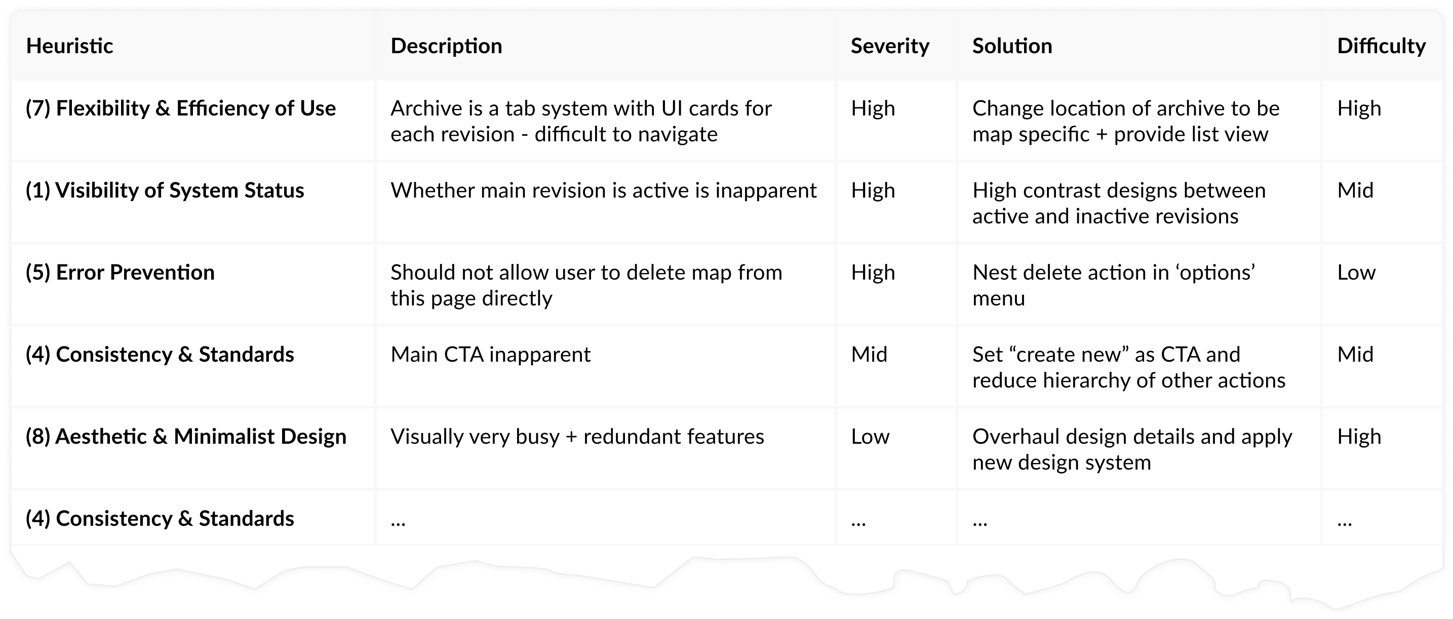
The analysis revealed 2 major areas of concern.
Visibility of System Status
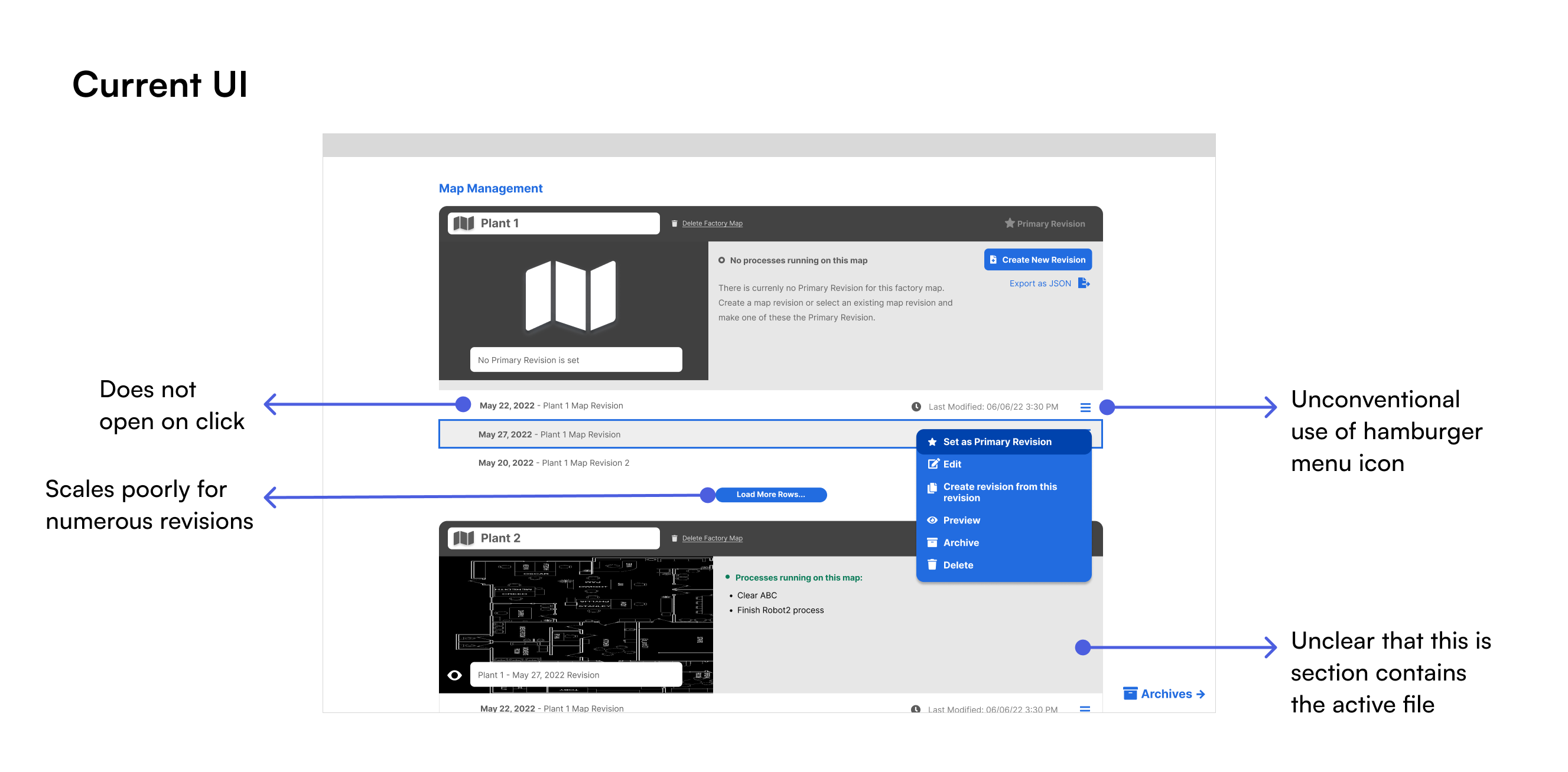
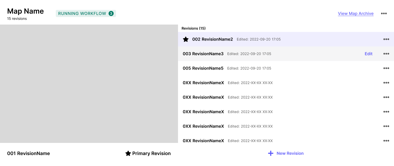
- Term 'primary' revision is ambiguous
- Presence of primary revision unclear
- Cannot identify statuses at a glance
Flexibility & Efficiency of Use
- Scales poorly
- Edit action is hidden in menu
System status is particularly important for this page for two reasons. The first is that users cannot make edits to a revision that is active and has devices attached that are live on the manufacturing plant floor. The second is that monitoring statuses is crucial to error prevention, problem resolution, and safety.
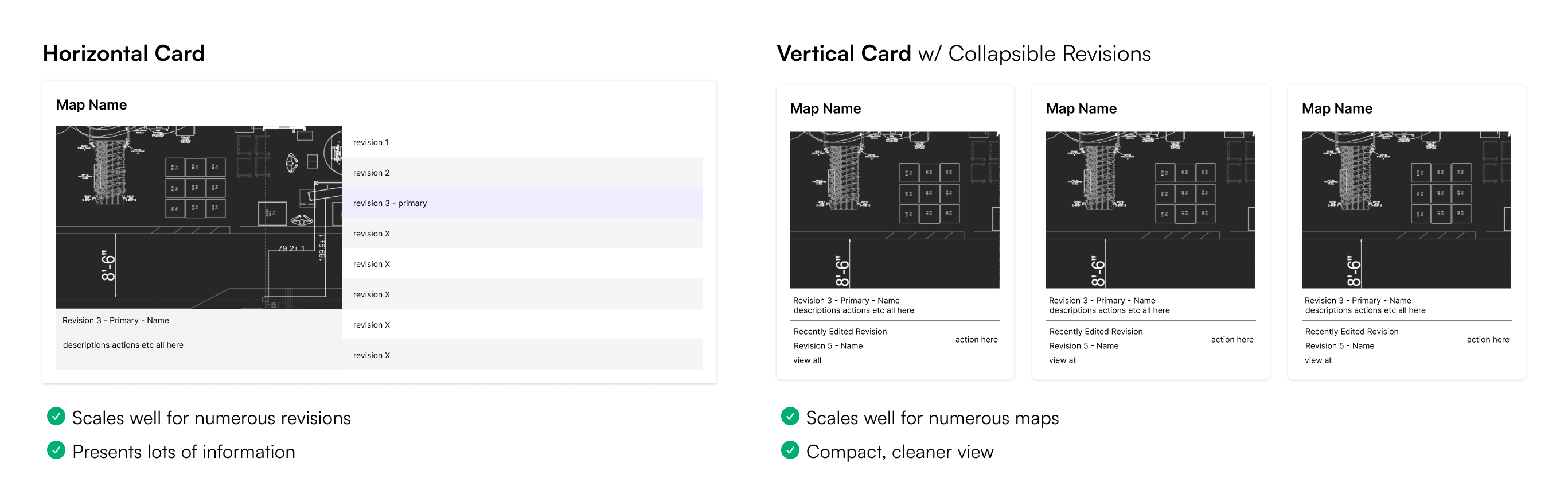
Design Options
Although this page was to function like a file directory, it differed from existing solutions (File Manager, Google Docs, OneDrive). Rather than accessing files individually, users wanted these files grouped by floorplan and accessed similar to version history. It would be like being able to access multiple folders' contents simultaneously on one screen.
With this in mind, I brainstormed alternative layouts to display these revisions.

With feasibility, usability, and common mental models in mind, these ideas were narrowed down to two: a horizontal card with scrollable revisions on the ride and a vertical card with collapsible revisions.
Roadblock
What do lean engineers really want to see on this page?
The selected design options are suitable for different use cases. However, no one on the Innovation Team truly knew how lean engineers would be interacting with this page nor their current conventions. Moving forward with either design would require bold assumptions.
User Input
No better way to understand engineers' workflows than from engineers themselves! To better define project goals and requirements, I met with lean engineers to discuss how they manage processes on the plant floor. Based on this, I learned that:
- Major floorplan layouts cycle through infrequently
- Minor changes occur on the plant floor daily
- Information should be obtained at a glance
What this means for the UI is that engineers want a layout that lets them see and create numerous revisions. At most, only two maps will be used simultaneously and cycle through based on vehicle production schedules, which last months. Because of this, I chose to move forward with the horizontal card layout.
Design
Iteration 1
I began to work on mid-fidelity prototypes in Figma.
- Users felt overwhelmed
- Bottom section raised confusion
- Star icon and purple background did not effectively communicate 'primary revision'
Iteration 2
The big change for this iteration was making the 'primary revision' visually distinct and semantically self-explanatory. To do so, I changed the term to 'active', indicating that it is in use. Labels are used to highlight this. I also separated it from the other revisions, now referred to as 'draft revisions'.
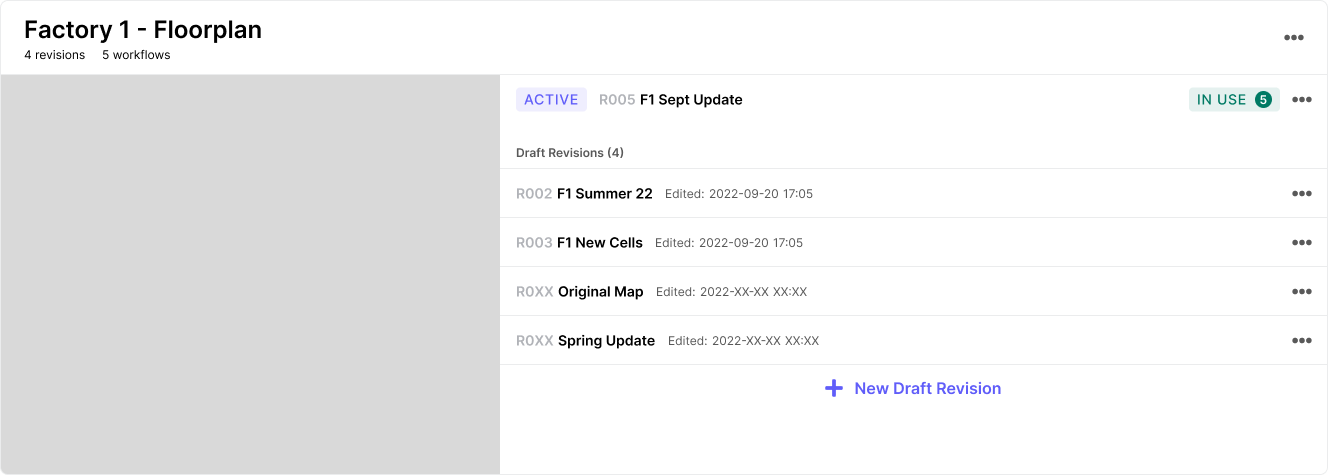
- Numerous draft revisions would hide 'new draft revision' button
- "In Use" label raised confusion
- Users wanted to see archived revisions w/o opening a new page
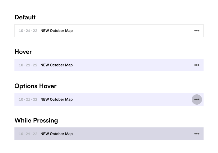
Row Design
While resolving issues from the previous iteration, I also had to specificlly focus on the row design of draft revivions. How much information should be shown? How should they be ordered?

In speaking with engineers, I learned the following:
- Revision numbers are uninformative
- Plant layouts are labelled and sorted by date in their system
- They don't care about the date & time last edited
- They would not use the preview/view function at all
This led to the updated row design that only shows the pieces of information requested by the users. Additionally, the user can simply open the revision in a new tab by clicking on the row, incidated by the hover state.
Final Iteration
This leads us to the final iteration.
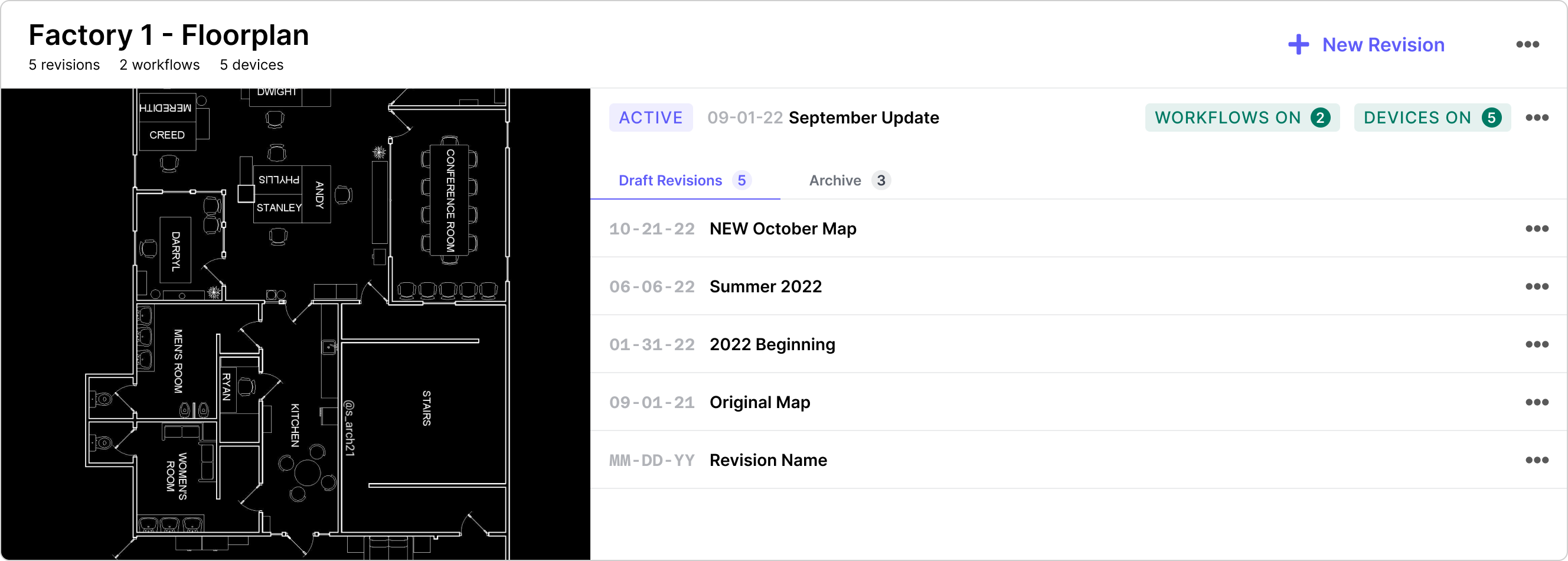
- Draft revisions are sorted by date (most recent on top)
- Workflow and device labels are separate with precise wording
- Archive can be accessed through a tab within the UI Card
- 'New Revision' button moved to top of UI Card
Final Solution
The final solution puts an emphasis on highlighting system status using labels. Additionally, it follows the lean engineers' existing naming conventions for their floorplans.

Next Steps
Search and Sort Maps
For further scalability and ease of use, it would be beneficial to allow users to navigate through different maps by providing searching and sorting features. Although it was not within scope for my project, it may certainly be a need within the next two years.
Sort Revisions
Allowing the user an alternative sorting method for draft revisions will improve flexibility of use. This was de-prioritized based on user input for this project, but it will be important to monitor how urgently users need this feature in practice.
Integration with Workflow and Device Pages
In consideration of the 'match between system and real world' usability heuristic, linking workflow, device, and map management pages will be crucial once they are ready. Users should easily be able to navigate between these pages, make edits, and be fully aware of statuses of each element in order to ensure success on the plant floor.
Takeaways
Internal UXR in technical spaces is best done with visuals
Low-fidelity sketches and mockups are not only useful for designers and developers to visualize journeys and gauge feasibility, but they are also very useful for informal UXR. Especially when workflows are complex and difficult to explain, having mockups on hand helps communicate a thousand words!
Colour is a useful tool for directing attention
In addition to aesthetics, colour is crucial when it comes to communication in UX. It leads users towards actions, displays errors, and communicates system state.

